
In the past several decades problems have become more complex. There is more data and information through which to sort. There are also greater interdependencies among those impacted by a decision. As a result, decision making has become more difficult.
The response has been greater focus on analytics and data-driven decision. Leaders are asking for more data and more tools to analyze the data. Yet, despite the increased attention and increased data, decisions don’t always improve.
Data and analytical tools are important. However, they aren’t enough on their own. Data and analytics only make a leader credible. Insight and interpretation make that leader valuable. But, insight and interpretation are increasingly hard to come by leaving many leaders simply falling back on the numbers.
One of the major causes of our inability to interpret and act on data is that our analytical tools and techniques are outdated.
It’s time to rethink the way we think about and use data.
Why rethink data?
Many of our analytical tools and techniques were designed for a much simpler world of data than currently exists.
Our brains are not designed to be analytical. Your brain works hard to map what it sees to what it already knows (in an effort to be more efficient). To do this it must distort, ignore, and sub-optimize data. Forty thousand years ago, when our brains were evolving to their current structure, this worked quite well. Things didn’t change much. Therefore, the ability to quickly link “new” things to “old” things, even if not always accurate, provided a survival advantage. Things change faster now than they did forty thousand years ago and there is more information to process. Most of the reports, charts, and graphs that we look at on a daily basis overwhelm us with data causing our brains to kick into higher gear in distorting, ignoring, and sub-optimizing. When presented with a lot of data, your brain’s first response is to filter as much of it out as possible. Unfortunately, most of this is happens unconsciously. Therefore, the likelihood of you seeing the one problem data point (out of one hundred) on the report decreases quickly.
A second yet related problem is due to the increase in the volume, dynamic nature, and intensity of data. Traditional tools were designed to analyze and display small, discrete, and static data. For example, when there were only three major broadcast networks and a handful of local and regional networks, having a ratings report showing all of them was somewhat manageable. Now with hundreds of channels to report on, that same ratings by channel report is virtually unusable. Yet, we still use reporting tools that try to display all of the data in one place. If your report is more than one page, you will fall into one of two traps: 1) you’ll miss what you need to see, or 2) you’ll spend a lot of time reviewing things you don’t need to see. Neither is helpful.
Finally, there is greater pressure to make faster, higher quality decisions and actions. Nobody’s job is just to know stuff. While deciding and acting have always been a leader’s job, it’s a bit harder now as decisions and actions are more dynamic with more inputs and interdependencies. Many of our tools and reports are designed around informing. They present information by category or metric. When there wasn’t a lot of data and there were fewer connections between the data, this worked fine. The gap between having information and making a decision was relatively small. However, now the gap between information and the decision the information drives has widened. Knowing consumer buying habits is important. But, the tie between those buying habits, your strategy, core competencies, and competitive position is what drives decisions.
Yet, most analysis and reports stop with the discrete facts instead of presenting data relative to decisions or providing actual answers to your questions. You have to work for those.
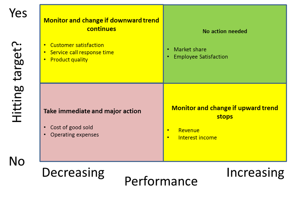
For example, most scorecard reports list each metric, their current level of performance, target, and some historical data. All of this is useful in some contexts, but it’s not actually what you want to know when you are looking at a scorecard. Your goal in looking at a scorecard isn’t to be informed about targets, performance, and history. Your goal is to figure out where you need to act. So why not organize it that way?
Most likely, when you review a traditional report like the one described above, you go line by line asking the same questions: is this metric hitting the target and how is it trending. But that’s inefficient. Why ask the same question over and over when you could just organize your data around the answer. A decision-driven report looks like this:

In this report, the metrics are organized by the question or decision rather than the data (and therefore the decision) being organized around the metric. You instantly see where you need to focus and where you don’t have to focus. It doesn’t force you to wade through data to answer your question, it simply provides the answer. You might be feeling uncomfortable that it doesn’t show any numbers. But, at this point, you actually don’t care about the numbers. You care about what the numbers mean which is what the report shows you.
Of course, you can still use other reports to get to the numbers if needed to diagnose or further understand the problem. But, for the initial question of where you should focus, the numbers are just an input, they are not the answer and having them on the report actually slows you down in getting to the answer.
Think about the reports you review on a regular basis. If you find that you are asking the same questions over and over on every line, or if you’ve adopted a color-coding scheme to highlight certain issues, change the report. Organize it around the questions you are asking or the colors you are using. That is the real information you are looking for.
How should we rethink data?
Rethinking data and analytics requires a one hundred and eighty degree shift from many of our historical practices.
The following table proposes five shifts in thinking about, using, and presenting data.
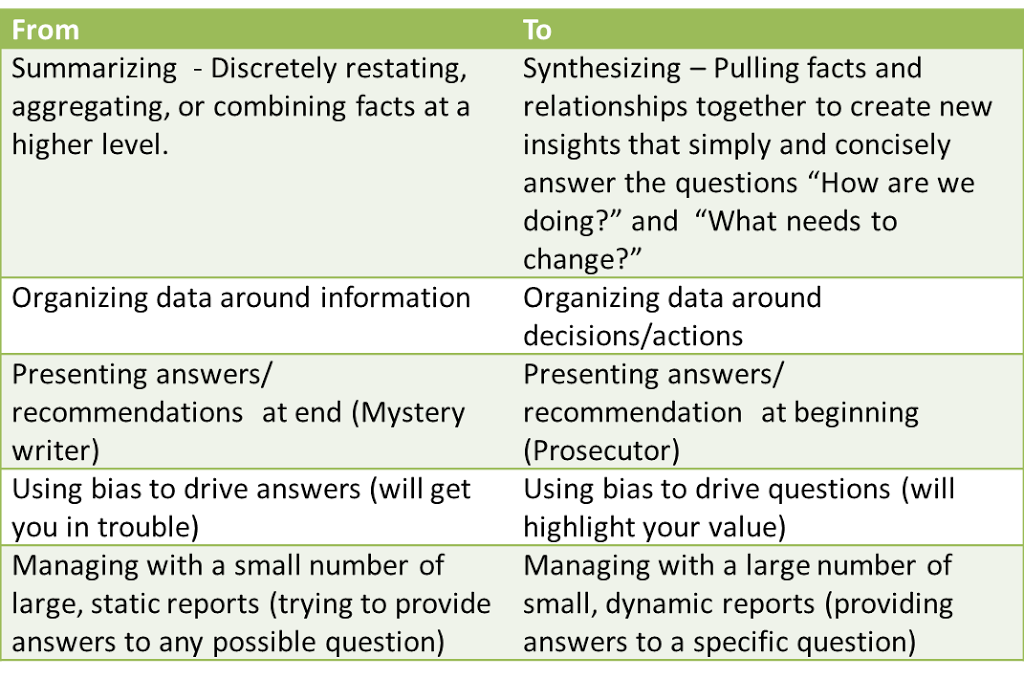
These shifts may look simple and even obvious. Most leaders have probably begun making some of them already. However there is tremendous organizational, technical, and historic inertia to pull us back to the old ways of doing things.
If your world is one of relatively static, simple, and discrete data, old techniques will still work. For the rest of us, it’s time for a change.
